Discovering and understanding the elements and principles of art will help you create more effective graphic works.
The Visual Elements
* Definitions are from Living With Art, Mark Getlein
*Visual Elements- line, shape, mass, light, value, color, texture, and space- the ingredients an artist has available in making any work of art
* Definitions are from Living With Art, Mark Getlein
*Visual Elements- line, shape, mass, light, value, color, texture, and space- the ingredients an artist has available in making any work of art
*Line- a path traced by a moving point
*Outline- defines a two-dimensional shape
*Contour- the perceived edges of a three-dimensional form such as the human body
*Contour lines- the lines we draw to record boundaries
*Direction and movement- our eyes follow lines to see where they are going. Artists use this tendency to direct our eyes around an image and to suggest movement. Most of us have instinctive reactions to the direction of line, which are related to our experience of gravity. Flat horizontal lines seem placid, like the horizon line or a body in repose. Vertical lines like those of an upright body or a skyscraper jutting up from the ground may have an assertive quality; they defy gravity in their upward thrust. But the most dynamic lines are the diagonals, which almost always imply action.
*Shape- a two-dimensional area having identifiable boundaries created by lines, color, a shift in texture, or value changes, or some combination of these
*Mass- a three-dimensional form that occupies a volume of space, often implying bulk, density and weight
*Geometric shapes and masses- approximately the regular, named shapes and volumes of geometry such as square, triangle, circle, cube, pyramid and sphere
*Organic shapes and masses- are irregular and evoke the living forms of nature
*Figure- the shape we detach and focus on
*Ground- the surrounding visual information the figure stands out from, the background
*Positive Shapes- the shapes we perceive as figures
*Negative Shapes- the shapes of the ground
*Values- shades of light and dark
*Hatching- a technique for suggesting value in which areas of closely spaced parallel lines are laid down
*Crosshatching- a technique for suggesting value in which sets of parallel lines are laid across a first set
*Stippling- a technique for suggesting value in which a pattern of closely spaced dots or small marks are used to create a sense of three-dimensionality on a flat surface
*Color- a function of light; reflected light rays
*Refraction- a bending of a ray of light, for example, when one passes through a prism
*Refraction- a bending of a ray of light, for example, when one passes through a prism
*Color wheel- taking the colors separated out by Newton’s prism- red, orange, yellow, green, blue, and violet > adding the transitional color (ex. red-violet, which does not exist in the rainbow) > arranging these colors in a circle
Three principles of color:
Three principles of color:
Hue
The quality that distinguishes one color family from another, as red from yellow or green from blue
• Hue and color are not synonyms.
Hue has only one dimension, color has three: hue, value and chroma.
Value
Value
The quality by which a light color is distinguished from a dark one
• Lightness of a color depends on the percentage of light reflected from the colored surface (lightest is white- most light is reflected, darkest is pitch black- no light is reflected. Gray- some light is partially absorbed, and partly reflected).
• Often referred to as Tints or Shades
Tint- a light color
Paint- color mixed with white paint
Watercolor- color diluted with water
Print- color made from widely placed dots (halftone)
Science- color mixed with white light
Computer- in the monitor three electron beams simulate red, blue and green phosphors to glow, tinting happens when all three beams are set comparatively high
Shade- may indicate any dark color, or any color mixed with black
• Only a small amount of white paint needs to be added to make the black paint much lighter and takes a much larger amount of white paint to make a light gray appear much lighter.
Chroma
Chroma
The strength or intensity of a color, the quality by which we distinguish a strong color from a weak or dull one, the amount of departure of a color from a gray of the same degree of lightness
Chroma involves the intensity and purity level in a hue that can range from fully saturated to infinite levels of neutrality.
• Neutralized or grayish colors show weak (LOW) chroma
• Intense colors show strong (HIGH) chroma
• Painters use the term saturation to indicate the relative proportion of pigment to filler, or medium, in paint.
• A saturated color is one with a strong chroma
• Easy to confuse chroma and value
With chroma it is possible to have a series of colors that gradually become grayer, without becoming darker
*Primary colors- red, yellow and blue- (theoretically) they cannot be made by any mixture of colors
*Primary colors- red, yellow and blue- (theoretically) they cannot be made by any mixture of colors
*Secondary colors- orange, green and violet- each is made by combining two primary color
*Tertiary colors- the product of a primary color and an adjacent secondary color (ex. mixing yellow and green yields yellow-green)
Primary Colors + Primary Colors = Secondary Colors
Primary Colors + Primary Colors = Secondary Colors
Red + Yellow= Orange
Yellow + Blue = Green
Red + Blue = Violet
Primary Colors + Secondary Colors = Tertiary Colors
Red + Orange = Red Orange
Orange + Yellow = Yellow Orange
Yellow + Green = Yellow Green
Green + Blue = Blue Green
Blue + Violet = Blue Violet
Violet + Red = Red Violet
*Warm colors- colors on the red-orange side of the wheel.
*Cool colors- colors on the blue-green side of the wheel
*Color harmonies or schemes- the selective use of two or more colors in a single composition
#1 Monochrome/ Monochromatic: “mono”=one. A color scheme using only one hue in a
range of different values.
#1 Monochrome/ Monochromatic: “mono”=one. A color scheme using only one hue in a
range of different values.
#2 Analogous: Colors closely related and adjacent on the color wheel. Variations of one
color family by the addition of neighboring colors on the wheel (ex. Yellow,
yellow-orange, orange).
color family by the addition of neighboring colors on the wheel (ex. Yellow,
yellow-orange, orange).
#3 Complementary: a color scheme incorporating opposite hues on the color wheel. They accentuate each other in juxtaposition and neutralize each other when mixed.
#4 Split Complementary: a color and the two colors on either side of its complement.
#5 Color Triad: three colors spaced equally apart on the color wheel forming a triangle
(your chosen triad colors will always have three other colors between them on the color wheel).
(your chosen triad colors will always have three other colors between them on the color wheel).
#6 Color Tetrad: Four colors selected to create harmony. Either: four equally spaced hues that are two sets of complements or four hues that are two sets of split complements (for example: select a complementary pair and instead of using them, use their neighbors).
*Simultaneous contrast- where complimentary colors appear more intense when placed side by side.
*Palette- The range of pigments the artist selects
*Restricted Palette- artists limit themselves to a few pigments and their mixtures, tints, and shades
*Optical color mixture- when small patches of different colors are close together, the eyes may blend them to produce a new color
*Pointillism- a quasi- scientific painting technique of the late 19th century, developed and promulgated by Georges Seurat and his followers, in which pure colors were applied in regular, small touches (points) that blended through optical color mixture when viewed at a certain distance
*Texture- refers to a surface quality; a perception of smooth or rough, flat or bumpy, fine or coarse
*Actual texture- literally tactile- a quality we could experience through touch
*Pattern- any decorative, repetitive motif or design
*Space- a dynamic visual element that interacts with the lines and shapes and colors and textures of a work of art that give them definition
*Picture plane- the literal surface of a painting, drawing or other two-dimensional art forms
*Linear perspective- based in the systematic application of two observations:
• forms seem to diminish in size as they recede from us
• parallel lines receding into the distance seem to converge, until they meet at a point (vanishing point) on the horizon line where they disappear
*Foreshortening- the visual phenomenon whereby an elongated object projecting toward or away from a viewer appears shorter than its actual length, as though compressed
*Atmospheric perspective- developed during the Renaissance it is based on the observation that distant objects appear less distinct, paler, and bluer than nearby objects due to the way moisture in the intervening atmosphere scatters light
*Isometric perspective- uses diagonal lines to convey recession, but parallel lines do not converge; principally used in East Asian art, which is not based in a fixed viewpoint
*Composition- the organization of lines, shapes, colors, and other art elements in a work; more often applied to two-dimensional art- the broader term is design
*Unity- a sense of oneness, of things belonging together and making up a coherent whole based in the elements of shape, line, color and so on
*Conceptual- through a unity of ideas
*Variety- difference provides interest.
*Visual weight- refers to the apparent “heaviness” or “lightness” of the forms arranged in a composition, as gauged by how insistently they draw our eyes
*Vertical axis- the implied center of gravity, an imaginary line drawn down the center of the composition
*Symmetrical balance- forms on either side of the vertical axis correspond to one another in size, shape, and placement (sometimes the symmetry is so perfect that the two sides of a composition are mirror images of one another)
*Asymmetrical balance- has two sides that do not match
*Emphasis- our attention is drawn more to certain parts of a composition than others
*Focal point- when the emphasis is on a relatively small, clearly defined area
*Subordination- certain areas of the composition are purposefully made less visually interesting, so that the areas of emphasis stand out
*Scale- size in relation to standard or “normal” size (normal size is the size we expect something to be)
*Proportion- refers to size relationships between parts of a whole, or between two or more items perceived as a unit.
*Hierarchical scale- the use of scale to indicate relative importance
*Rhythm- based in repetition, and is a basic part of the world we find ourselves in; natural rhythms measure out the passing of time, organizing our experience of it
We will begin with projects based on image using the elements and principles of art in order for you to learn the tools available to carry out larger design projects. Below elements important to Graphic Design such as shape, line, direction, size, color, value and texture, will be reviewed. To start we will explore some options using Adobe Illustrator.
Illustrator Tools and Basic Design Elements
Tools reference:
http://www.coe.fau.edu/abinder/handouts/Itools.htm
Illustrator Palettes
 The default palettes in Adobe Illustrator are:
- Color
- Swatches/Brushes/Symbols
- Stroke/Gradient/Transparency
- Appearance/Graphic Styles
- Layers
SHAPE
Shape tool basics (read and follow instructions):
LINE
Pen tool basics (read and follow instructions):
CS2 Exercises can be downloaded from Veerle's Blog at:
COLOR
*Read Chapter 2 in your text and follow the exercises. #1 Monochrome/ Monochromatic: “mono”=one. A color scheme using only one hue in a
range of different values.
#2 Analogous: Colors closely related and adjacent on the color wheel. Variations of one
color family by the addition of neighboring colors on the wheel (ex. Yellow,
yellow-orange, orange).
color family by the addition of neighboring colors on the wheel (ex. Yellow,
yellow-orange, orange).
#3 Complementary: a color scheme incorporating opposite hues on the color wheel. They accentuate each other in juxtaposition and neutralize each other when mixed.
#4 Split Complementary: a color and the two colors on either side of its complement.
#5 Color Triad: three colors spaced equally apart on the color wheel forming a triangle
(your chosen triad colors will always have three other colors between them on the color wheel).
(your chosen triad colors will always have three other colors between them on the color wheel).
#6 Color Tetrad: Four colors selected to create harmony. Either: four equally spaced hues that are two sets of complements or four hues that are two sets of split complements (for example: select a complementary pair and instead of using them, use their neighbors).
Gradients
How to Create a Custom Adobe Illustrator Gradient
32 Handy Gradient Tutorials
Gradient Mesh Flower
Raster (Bitmap/Photoshop) Graphics vs. Vector (Illustrator) Graphics
Raster graphics are composed of pixels often called bitmap images Vector graphics are composed of paths. Read the following article: http://www.sketchpad.net/basics1.htm
Put Photoshop Work into Illustrator:
•To open the file directly in Illustrator choose File>Open. Locate/ select the image and click OK.
Put Photoshop Work into Illustrator:
•To open the file directly in Illustrator choose File>Open. Locate/ select the image and click OK.
•To place the image into an existing Illustrator file, choose File> Place (this must be done for Live Trace).
•Linking to the Original File: •To place the image into an existing Illustrator file and keep it linked to the original, choose File> Place. Locate the image, select the Link option and click OK. The image will appear centered in your Illustrator document and a red X through your link will indicate it is linked and not editable.
•Another option is to simply drag a file directly from Photoshop or the desktop in to your working file in Illustrator.
Live Trace Option:
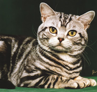
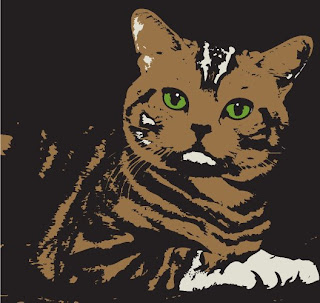
Google Image of Cat BEFORE /AFTER


You will find an image of yourself and use the live trace option to make it look Illustrative. If you do not have access to an image of yourself online, the instructor will help you scan in your ID picture.


No comments:
Post a Comment