Welcome Back!!!

Throughout the semester you will be presented with the basic principles of graphic design and explore them through problem-solving assignments using both studio and computer practices. You will develop a keen sense for conceptual and visual content.

For the duration of this course you will follow the graphic design process of research, idea development, visualization and execution for every assignment. Your design work should always intellectually stimulate and challenge you as well as your audience. It must always communicate its ideas in a clear, concise and effective manner without you having to provide an explanation. Your design work must succeed aesthically and your craftsmanship must always be solid in its execution.

Below is a materials of items you will need:


Sketchbook 8”x10”-11”x14”
Drawing pencils- 6B (softest) -6H (hardest)
White plastic eraser (Steadler Mars)
Black pens- Micron, gel or Faber-Castell Pitt Artist Pens recommended
Black Sharpies (various tips- ultra fine, fine, chisel tip…)
Black illustration/ mounting boards
Xacto knife and replacement blades
Self-healing cutting mat
UHU glue stick- large
Rubber Cement
Cork backed ruler (at least 18”)

Presentation Portfolio
Flash Drive- 1GB or larger
CD-R Disk
Digital Camera and USB Cord (if owned)
* Additional materials may be added at a later date.

*When in the computer lab remember to ALWAYS SAVE YOUR WORK!!!


Textbook
TEXT: Graphic design Essentials: Skills, Software, and Creative Solutions         

Joyce Walsh Macario
ISBN: 978-0-13-605235-7

General Assignment Rubric:


WELCOME BACK!!!

Introducing Graphic Design...

Graphic Design is a communication art based on an exchange of information and is considered a commercial art form. It is the application of design principles and aesthetics to functional items for everyday use and consumption. Commercial art is a sub sector of creative services, and refers to art created for commercial purposes, primarily advertising.
Graphic Designers prepare visual representations of ideas or messages for print or electronic forms of information, such as advertisements, publications, or websites.

What is Graphic Design? Article
http://www.aiga.org/content.cfm/guide-whatisgraphicdesign


Milton Glaser: To Inform and Delight

In order to better understand what a graphic designer does we will view the film about the revered  Milton Glaser. 

"Milton Glaser (b.1929) is among the most celebrated graphic designer in the United States. He has had the distinction of one-man-shows at the Museum of Modern Art and the Georges Pompidou Center. In 2004 he was selected for the lifetime achievement award of the Cooper Hewitt National Design Museum. As a Fulbright scholar, Glaser studied with the painter, Giorgio Morandi in Bologna, and is an articulate spokesman for the ethical practice of design. He opened Milton Glaser, Inc. in 1974, and continues to produce an astounding amount of work in many fields of design to this day." http://www.miltonglaser.com/pages/milton/mg_index.html

For more information- works, film clips, case studies...:
http://www.miltonglaser.com/index2.html

Important terms related to Graphic Design:
See Graphic Design Dictionary.com
http://www.graphicdesigndictionary.com/index.html

The Blog

Personal Blog

The blog will be introduced as a tool for students to use for online exposure. The web blog will consist of all major coursework and exercises done in this course along with descriptions of and ideas pertaining to each project. It will serve as an online journal of your thoughts, creative processes, progression in coursework and as an online art portfolio.


Goals:
• To create a visually appealing and informative web log
• To recognize the importance of updating work online
• To edit your web blog consistently
• To use the blog as an online journal of your progression in this class and share it with classmates
• To display a portfolio of design work online
• To begin to understand how to transfer your work onto the Internet

Guidelines:
• Customize your blog template. Make the design as visually appealing as possible.
• Post images of all major assignments and exercises with brief explanations of each project including your intent and ideas. Information on posting is below.
• Add personal posts of information and images as you see fit.
• View classmate’s blogs periodically and post any relevant and constructive comments you might have.

• Due Date: To be maintained and periodically reviewed by instructor and classmates throughout the entire semester. Final review of the blog will take place during final individual critiques- TBA.

Photographing images for blog posting
Illustrator images can be posted to your blog by holding down shift, Apple/Command, and 4. A target will appear. Click and drag the mouse over the entire contents of your design. This will take a picture of the page which will automatically save to your desktop as Picture 1. 


Adding images to the blog
For the most part images can be uploaded directly. If there is a problem opening the image, first open up the image in PhotoShop and go to File> Save As. Create a new title such as "Logo" and save it as a JPEG image. Save to your thumbdrive and try again.

Add picture by clicking this Icon:

Follow the directions for uploading images when prompted.


Posting images from a Power Point Presentation
In PowerPoint go to View menu>Notes Page.Here you can scroll down each slide using the side bar. On each page take a picture of only your slide by holding down Apple/Command, Shift, and 4. You will target the slide and drag over it to copy the image. The image should appear on your desktop
as Picture 1... Save to your thumbdrive. Starting from the last slide up will place them in the correct order on the blog-- it is more efficient this way.

Posting Images from PhotoShop
In order to post tutorials and assignments to your blog save them in PhotoShop as a JPEG (.jpg) file. Be sure your image is set as an RGB file at a resolution of 72.
Save to your thumbdrive.


Past GRAPHIC DESIGN 315 A Blogs:

Sample Blog Page For Students:
Nicole's Blog:

Design Basics and Illustrator Basics

Discovering and understanding the elements and principles of art will help you create more effective graphic works.


The Visual Elements
* Definitions are from Living With Art, Mark Getlein

*Visual Elements- line, shape, mass, light, value, color, texture, and space- the ingredients an artist has available in making any work of art

*Line- a path traced by a moving point

*Outline- defines a two-dimensional shape

*Contour- the perceived edges of a three-dimensional form such as the human body

*Contour lines- the lines we draw to record boundaries

*Direction and movement- our eyes follow lines to see where they are going. Artists use this tendency to direct our eyes around an image and to suggest movement. Most of us have instinctive reactions to the direction of line, which are related to our experience of gravity. Flat horizontal lines seem placid, like the horizon line or a body in repose. Vertical lines like those of an upright body or a skyscraper jutting up from the ground may have an assertive quality; they defy gravity in their upward thrust. But the most dynamic lines are the diagonals, which almost always imply action.

*Shape- a two-dimensional area having identifiable boundaries created by lines, color, a shift in texture, or value changes, or some combination of these

*Mass- a three-dimensional form that occupies a volume of space, often implying bulk, density and weight

*Geometric shapes and masses- approximately the regular, named shapes and volumes of geometry such as square, triangle, circle, cube, pyramid and sphere

*Organic shapes and masses- are irregular and evoke the living forms of nature

*Figure- the shape we detach and focus on

*Ground- the surrounding visual information the figure stands out from, the background

*Positive Shapes- the shapes we perceive as figures

*Negative Shapes- the shapes of the ground

*Values- shades of light and dark

*Hatching- a technique for suggesting value in which areas of closely spaced parallel lines are laid down

*Crosshatching- a technique for suggesting value in which sets of parallel lines are laid across a first set

*Stippling- a technique for suggesting value in which a pattern of closely spaced dots or small marks are used to create a sense of three-dimensionality on a flat surface


*Color- a function of light; reflected light rays

*Refraction- a bending of a ray of light, for example, when one passes through a prism

*Color wheel- taking the colors separated out by Newton’s prism- red, orange, yellow, green, blue, and violet > adding the transitional color (ex. red-violet, which does not exist in the rainbow) > arranging these colors in a circle

Three principles of color:
Hue
The quality that distinguishes one color family from another, as red from yellow or green from blue
• Hue and color are not synonyms.
Hue has only one dimension, color has three: hue, value and chroma.

Value
The quality by which a light color is distinguished from a dark one
• Lightness of a color depends on the percentage of light reflected from the colored surface (lightest is white- most light is reflected, darkest is pitch black- no light is reflected. Gray- some light is partially absorbed, and partly reflected).
• Often referred to as Tints or Shades
Tint- a light color
Paint- color mixed with white paint
Watercolor- color diluted with water
Print- color made from widely placed dots (halftone)
Science- color mixed with white light
Computer- in the monitor three electron beams simulate red, blue and green phosphors to glow, tinting happens when all three beams are set comparatively high
Shade- may indicate any dark color, or any color mixed with black
• Only a small amount of white paint needs to be added to make the black paint much lighter and takes a much larger amount of white paint to make a light gray appear much lighter.

Chroma
The strength or intensity of a color, the quality by which we distinguish a strong color from a weak or dull one, the amount of departure of a color from a gray of the same degree of lightness
Chroma involves the intensity and purity level in a hue that can range from fully saturated to infinite levels of neutrality.
• Neutralized or grayish colors show weak (LOW) chroma
• Intense colors show strong (HIGH) chroma
• Painters use the term saturation to indicate the relative proportion of pigment to filler, or medium, in paint.
• A saturated color is one with a strong chroma
• Easy to confuse chroma and value
With chroma it is possible to have a series of colors that gradually become grayer, without becoming darker

*Primary colors- red, yellow and blue- (theoretically) they cannot be made by any mixture of colors

*Secondary colors- orange, green and violet- each is made by combining two primary color

*Tertiary colors- the product of a primary color and an adjacent secondary color (ex. mixing yellow and green yields yellow-green)

Primary Colors +
Primary Colors = Secondary Colors
Red + Yellow= Orange
Yellow + Blue = Green
Red + Blue = Violet 

Primary Colors + Secondary Colors = Tertiary Colors
Red + Orange = Red Orange 
Orange + Yellow = Yellow Orange
Yellow + Green = Yellow Green
Green + Blue = Blue Green
Blue + Violet = Blue Violet
Violet + Red = Red Violet

*Warm colors- colors on the red-orange side of the wheel.

*Cool colors- colors on the blue-green side of the wheel

*Color harmonies or schemes- the selective use of two or more colors in a single composition

#1 Monochrome/ Monochromatic: “mono”=one. A color scheme using only one hue in a
range of different values.

#2 Analogous: Colors closely related and adjacent on the color wheel. Variations of one
color family by the addition of neighboring colors on the wheel (ex. Yellow,
yellow-orange, orange).

#3 Complementary: a color scheme incorporating opposite hues on the color wheel. They accentuate each other in juxtaposition and neutralize each other when mixed.
#4 Split Complementary: a color and the two colors on either side of its complement.
#5 Color Triad: three colors spaced equally apart on the color wheel forming a triangle
(your chosen triad colors will always have three other colors between them on the color wheel).

#6 Color Tetrad: Four colors selected to create harmony. Either: four equally spaced hues that are two sets of complements or four hues that are two sets of split complements (for example: select a complementary pair and instead of using them, use their neighbors).

*Simultaneous contrast- where complimentary colors appear more intense when placed side by side.

*Palette- The range of pigments the artist selects

*Restricted Palette- artists limit themselves to a few pigments and their mixtures, tints, and shades

*Optical color mixture- when small patches of different colors are close together, the eyes may blend them to produce a new color

*Pointillism- a quasi- scientific painting technique of the late 19th century, developed and promulgated by Georges Seurat and his followers, in which pure colors were applied in regular, small touches (points) that blended through optical color mixture when viewed at a certain distance

*Texture- refers to a surface quality; a perception of smooth or rough, flat or bumpy, fine or coarse

*Actual texture- literally tactile- a quality we could experience through touch

*Pattern- any decorative, repetitive motif or design

*Space- a dynamic visual element that interacts with the lines and shapes and colors and textures of a work of art that give them definition

*Picture plane- the literal surface of a painting, drawing or other two-dimensional art forms

*Linear perspective- based in the systematic application of two observations:
• forms seem to diminish in size as they recede from us
• parallel lines receding into the distance seem to converge, until they meet at a point (vanishing point) on the horizon line where they disappear

*Foreshortening- the visual phenomenon whereby an elongated object projecting toward or away from a viewer appears shorter than its actual length, as though compressed

*Atmospheric perspective- developed during the Renaissance it is based on the observation that distant objects appear less distinct, paler, and bluer than nearby objects due to the way moisture in the intervening atmosphere scatters light

*Isometric perspective- uses diagonal lines to convey recession, but parallel lines do not converge; principally used in East Asian art, which is not based in a fixed viewpoint


The Principles of Design


*Composition- the organization of lines, shapes, colors, and other art elements in a work; more often applied to two-dimensional art- the broader term is design

*Unity- a sense of oneness, of things belonging together and making up a coherent whole based in the elements of shape, line, color and so on

*Conceptual- through a unity of ideas

*Variety- difference provides interest.

*Visual weight- refers to the apparent “heaviness” or “lightness” of the forms arranged in a composition, as gauged by how insistently they draw our eyes

*Vertical axis- the implied center of gravity, an imaginary line drawn down the center of the composition

*Symmetrical balance- forms on either side of the vertical axis correspond to one another in size, shape, and placement (sometimes the symmetry is so perfect that the two sides of a composition are mirror images of one another)

*Asymmetrical balance- has two sides that do not match

*Emphasis- our attention is drawn more to certain parts of a composition than others

*Focal point- when the emphasis is on a relatively small, clearly defined area

*Subordination- certain areas of the composition are purposefully made less visually interesting, so that the areas of emphasis stand out

*Scale- size in relation to standard or “normal” size (normal size is the size we expect something to be)

*Proportion- refers to size relationships between parts of a whole, or between two or more items perceived as a unit.

*Hierarchical scale- the use of scale to indicate relative importance

*Rhythm- based in repetition, and is a basic part of the world we find ourselves in; natural rhythms measure out the passing of time, organizing our experience of it
We will begin with projects based on image using the elements and principles of art in order for you to learn the tools available to carry out larger design projects.  Below elements important to Graphic Design such as shape, line, direction, size, color, value and texture, will be reviewed.  To start we will explore some options using Adobe Illustrator.

Illustrator Tools and Basic Design Elements


Tools reference:
http://www.coe.fau.edu/abinder/handouts/Itools.htm


Illustrator Palettes
The default palettes in Adobe Illustrator are:
  1. Color
  2. Swatches/Brushes/Symbols
  3. Stroke/Gradient/Transparency
  4. Appearance/Graphic Styles
  5. Layers


SHAPE
Shape tool basics (read and follow instructions):


LINE


Pen tool basics (read and follow instructions):


CS2 Exercises can be downloaded from Veerle's Blog at:


COLOR
*Read Chapter 2 in your text and follow the exercises. 


*Color wheel


#1 Monochrome/ Monochromatic: “mono”=one. A color scheme using only one hue in a
range of different values.

#2 Analogous: Colors closely related and adjacent on the color wheel. Variations of one
color family by the addition of neighboring colors on the wheel (ex. Yellow,
yellow-orange, orange).

#3 Complementary: a color scheme incorporating opposite hues on the color wheel. They accentuate each other in juxtaposition and neutralize each other when mixed.
#4 Split Complementary: a color and the two colors on either side of its complement.
#5 Color Triad: three colors spaced equally apart on the color wheel forming a triangle
(your chosen triad colors will always have three other colors between them on the color wheel).

#6 Color Tetrad: Four colors selected to create harmony. Either: four equally spaced hues that are two sets of complements or four hues that are two sets of split complements (for example: select a complementary pair and instead of using them, use their neighbors).


VALUE
Gradients

How to Create a Custom Adobe Illustrator Gradient

32 Handy Gradient Tutorials

Gradient Mesh Flower

Raster (Bitmap/Photoshop) Graphics vs. Vector (Illustrator) Graphics

Raster graphics are composed of pixels often called bitmap images Vector graphics are composed of paths. Read the following article: http://www.sketchpad.net/basics1.htm

Put Photoshop Work into Illustrator:

•To open the file directly in Illustrator choose File>Open. Locate/ select the image and click OK.

•To place the image into an existing Illustrator file, choose File> Place (this must be done for Live Trace).
•Linking to the Original File: •To place the image into an existing Illustrator file and keep it linked to the original, choose File> Place. Locate the image, select the Link option and click OK. The image will appear centered in your Illustrator document and a red X through your link will indicate it is linked and not editable.
Another option is to simply drag a file directly from Photoshop or the desktop in to your working file in Illustrator.

Live Trace Option:

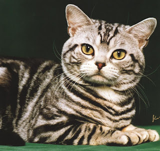
Google Image of Cat BEFORE /AFTER


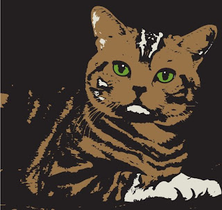
You will find an image of yourself and use the live trace option to make it look Illustrative. If
you do not have access to an image of yourself online, the instructor will help you scan in your ID picture.


Computer Illustration

Think about the term Illustration.  Illustration means to clarify or explain a text or concept visually.  

See the following artists for examples of contemporary illustration:
 
Jeremy Fish

Aesop Rock featuring Jeremy Fish illustration

Interview


Mike Giant

Camille Rose Garcia


Persepolis the Graphic Novel
Persepolis: Marjane Satrapi
Trailer


We will explore the art of Illustration through the assignment below.


Assignment #1: Digital Woodcut


You will make a digital woodcut in Illustrator using an original design or image based on a text or concept of your choice. Your woodcut will be generated through an additive process of layering shapes. You will use the pen tool to complete shapes, as well as the shape tool for prefabricated shapes (circles, squares…). Remember to keep shapes hard-edged and sharp. See links for original and digital woodcuts on the class blog.

Purpose: This assignment is a valuable introduction to the basic use of specific tools in Adobe Illustrator. The shape tool, pen tool, transparency option and color palette will be a necessity when designing vector-based items such as symbols and logos in your future work.


Goals:
• To create a digital woodcut in Illustrator that gives the appearance of an original woodcut by layering shapes, some of which are sharp and hard-edged.

• To use the pen tool in a planned out and controlled manner. You will learn to control lines
• To use the shape tool for simple circles, ovals, squares, rectangles… when appropriate.
• To create a strong composition keeping in mind design principles such as:
Emphasis, Balance, Rhythm, Contrast, Movement and Harmony
.
• To begin to understand the difference between vector and raster images and in some cases transfer raster images into Illustrator.

Guidelines:
•Your Illustrator woodcut created in Adobe Illustrator may be horizontal or vertical and must be letter size.
•Save your work as an Ai file as well as a PDF.  E-mail your PDF to the instructor by 12:00 pm 2/9/10.  You will be given two copies: one copy will be mounted in class for critique the other will be placed in your portfolio.
•Save your work! A CD will be handed in at the end of the semester containing all of your coursework.
•Post your woodcut to your blog.  See the "Blog" topic on directions for posting.
•Assignment must be completed for group critique by 2/9/10.

Examples of original woodcuts/ linocuts:

http://www.oakton.edu/news/events/gallery/birowood.htm
l

No Business, Louis Weiner (1892-1967)

http://www.cannonballpress.com/

Deja Vu, Martin Mazorra

http://www.howlingprint.com/


Wolf Carcus, Dennis McNett

Examples of digital woodcuts:
http://www.filmnoirwoodcuts.com/


Phantom Lady
, Guy Budziak

http://www.bruteprop.com/


Panic Attack, Aiden Hughes

Resource site for illustration:
CSA Images:
A modern design resource and digital museum of art for commerce
http://www.csaimages.com/Index.asp

Visual Communication: Symbols,Lettering,Typography

Image-based Design

Symbols have a visual structure and are abstract representations of a particular idea or identity. Symbol based communication has a rich history.  Read more here : http://www.designhistory.org/symbols.htm

Symbols can promote commmunication  and  help people make choices. They provide universal understanding.  Read more here:

Assignment #2: Visual Communication: Symbols

The purpose of this assignment is for you to visually communicate ideas without the use of words in a clear and effective manner. You will work through the graphic design process of research, idea-development, visualization and execution through studio and computer practice.

Part A: Design a symbol for a generic subject such as a type of place or event.

Examples:
• Tattoo Parlor • Bank • Real Estate Agency • Hotel • Casino • Construction Zone • Sports Complex• Skateboard Park • Arcade • Rock Club • Rock Concert • Arts Festival •Deli• Pizza Place• Restaurant• Amusement Park• Carnival• Circus• School •Church •Synagogue •Hospital

Part B: Combine two existing symbols to create a new one. Research your symbols and carefully choose two that will intersect well. You must consider the original meanings behind the symbols you choose when creating your new meaningful symbol.

Goals:
• To communicate an idea in a simple and effective manner
• To use the elements and principles of design to create an interesting visual symbol
• To conquer the design process through problem solving
• To execute well-crafted works
• To use knowledge acquired in Illustrator for coloring and altering symbols
• To practice controlling the shape tool and pen tool when altering symbols
• To further explore the Illustrator palettes
• To present works in a clean, professional manner

Guidelines:
• Make thumbnail sketches and work out your ideas in your journals before executing your project
• Begin by drawing a shape
• Create a symbol to fit entirely within each shape
The shape acts as the outline for the symbol; give thought to how you will place the image within this shape
• Do not use type as part of your symbol design
• Choose your most successful symbol and draw it out in a larger scale using black and white media ( Sharpies, gouache, acrylic…)
• Scan your symbol into the computer
• Use Illustrator to color your symbol accordingly
Choose appropriate colors to convey your message
Consider the meaning and mood when choosing colors
•Save your work as an Ai file as well as a PDF.  E-mail your PDF to ndul@gershmany.org by 12:00 pm 2/23/10.   You will be given two copies: one copy will be mounted in class for critique and the other will be placed in your portfolio.
•Save your work! A CD will be handed in at the end of the semester containing all of your coursework.
• Post your symbols to your blog. See the "Blog" topic on directions for posting.
•Assignment must be completed for group critique by 2/23/10.

Symbol Resources:

The link below provides a catalog of symbols with meanings.

The link below will take you to a website that shares signage for hospitals, railway/ bus stations, buildings, airports and hand symbols.
Application of Signage Systems

The link below shows us road signs.

Type-based Design

Robert Smith (author of Basic Graphic Design) states that the use of the alphabet is what particularly distinguishes graphic design from other visual arts. Our next few assignments will address typography combined with symbolic imagery.

Typography is communication designed by means of the printed word.

Typography is basically broken down into three categories:

Serif

This is an example of a serif font:

Georgia


This is an example of a san serif font:

Arial

See the difference:

Georgia: ABCDEFGHIJKLMNOPQRSTUVWXYZ
Arial: ABCDEFGHIJKLMNOPQRSTUVWXYZ

Script

A font written in script appears to be handwritten.

The above categories are made up of families of typefaces or fonts.
For example:


Typefaces can be symbolic of not only language but emotion. For example the typeface you may use for the word (Sixty Seven Font) may be different from the type you may use for the word (Title Wave Font). How does the word's meaning change when we see it printed like this:

Mac's Font Book

The FONT BOOK will be found under APPLICATIONS in the MACINTOSH HD


Mac 101: Font Book

MacRumors: Guides Font Book

*To add a downloaded font to your font book click on FILE>ADD FONTS, browse to find your font, select it and OPEN.

Free fonts: When downloading free fonts occasionally websites confuse Mac with Windows. If you download a Mac font that does not seem to want to open, try the Windows version, it may just work. Google free fonts or try some of the following links:
Use the pen tool to create a curved path and the type your phrase.
http://www.ndesign-studio.com/resources/tutorials/3d-logo/

Cracked Font


Figure-ground tutorial from Vector-art blog

Information on various computer tutorials:
This is a page for Logos:
http://vector-art.blogspot.com/search/label/Logo%20Design


Use the pen tool or live trace to add an illustration and then type your phrase.
Bleeding Cowboy Font
Place images within your text:
• "Place" or insert your images into your document and the "send to back" in the object menu. The logo will appear on top.
• Select "all" then go to the Object menu and choose "Clipping Mask," then choose "Make."
In your text:
Page 84
Type on Path


Page 86
Shape and Type on Path


Page 94
Convert Type to Shapes


Assignment #3: Type Illustration


Choose one of the following action words and a font which is symbolic of both the meaning and emotion conveyed by your word.
Bake
Build
Collapse
Dance
Destroy
Drink
Eat
Exercise
Explode
Fight
Find
Fly
Grow
Hunt
Jump
Kick
Look
Lose
Play
Pull
Push
Punch
Repeat
Run
Shrink
Sing
Throw
Walk

Illustrate an action word or a sentence containing your action word using the chosen font in a
6" x 8" format. Illustrate your word using text as the basis for your design by selectively enlarging a letterform (the design of the shape of an alphabet letter) in the chosen font.  Alter the enlarged letter using a variety of techniques by adding texture, text or image. This assignment will show you how to activate your page using type as the main component in your design. Examples will be shown in class. Your completed design will be printed in full color.
Goals:
• To work through the design processes of research, idea-development, visualization and execution through studio and computer practice
• To communicate an idea in a simple and effective manner
• To use the elements and principles of design to create an interesting design
• To begin to incorporate text with image
• To choose an appropriate font for your action word which expresses meaning and emotion
• To understand the Mac's Font Book and how to download free fonts online
• To use knowledge acquired in Illustrator for completing your design
• To present well-crafted work in a clean and professional manner

Guidelines:
• Choose an action word
• Find an appropriate font using Internet free fonts (Google search) and the Mac’s font book
• Open a new 6" x 8" file
• Alter and enlarge a letterform using the font you have chosen
in Illustrator
• Use Illustrator to add the other letters to your action word or make a sentence containing your action word
• Polish and complete your design in Illustrator
•Save your work as an Ai file as well as a PDF.  E-mail your PDF to ndul@gershmany.org by 12:00 pm 3/16/10.   You will be given two copies: one copy will be mounted in class for critique and the other will be placed in your portfolio.
•Save your work! A CD will be handed in at the end of the semester containing all of your coursework.
• Post your symbols to your blog. See the "Blog" topic on directions for posting.
•Assignment must be completed for group critique by 3/16/10.

Identity
Logos, symbols, and brandmarks are terms used when creating identities. Identity in graphic design includes the use of corporate titles, logotype and/or logograms (symbols) that follow specific criteria involving the use of color palettes, typefaces, and page layouts. It is important in the creation of a corporate identity that all materials are consistent in visual appearance and that the brand is easily identifiable. Companies often have their own identity that can be seen on all of their products and merchandise.

Tips:
  • Make your identity distinctive
  • Consider the context-- What type of company? Who are its clients?
  • Target a specific audience-- Appeal to the consumer
  • Follow principles of design
  • Keep it clear and simple
  • Ask for input- Can people understand what you are trying to communicate?
  • Review and Revise
Examples of Corporate Identity:
  
Milton Glaser
"Milton Glaser (b.1929) is among the most celebrated graphic designer in the United States. He has had the distinction of one-man-shows at the Museum of Modern Art and the Georges Pompidou Center. In 2004 he was selected for the lifetime achievement award of the Cooper Hewitt National Design Museum. As a Fulbright scholar, Glaser studied with the painter, Giorgio Morandi in Bologna, and is an articulate spokesman for the ethical practice of design. He opened Milton Glaser, Inc. in 1974, and continues to produce an astounding amount of work in many fields of design to this day." http://www.miltonglaser.com/pages/milton/mg_index.html

For more information- works, film clips, case studies...:
http://www.miltonglaser.com/index2.html

Logo designs turned into art:
Corporate Signs

By David Byrne and Danielle Spencer

A series of lenticular images based on corporate signs photographed at Research Triangle Park, North Carolina. Multinational tombstones nestled in the (landscaped) pastoral glade. When viewed from different angles the original corporate name transforms and flickers into a virtuous attribute. A utopian vision in the American countryside.


2/16/10 Exercise: Digitally photograph examples (at least 15) of logos that successfully communicate their ideas through text, symbol or both. Save your images to a flash drive. We will view them in class. What are your examples trying to communicate? What methods are used to communicate the ideas? Describe the details that make your examples successful.


Assignment #4: Logo Design

This assignment will address some fundamentals of typography combined with symbolic imagery. It is important to consider how you would capture the attention of a client or prospective buyer when designing your logo. Your assignment is to create a new logo for an existing or fabricated company. You must include at least three presentations of design options for group critique before completing your Logo in Illustrator. Keep your logo as simple and clear as possible.

Goals:
• To work through the design processes of research, idea-development, visualization and execution through studio and computer practice
• To communicate an idea in a simple and effective manner
• To use the elements and principles of design to create an interesting design
• To incorporate text with symbolic imagery
• To choose an appropriate font for your logo which expresses meaning and emotion
• To understand the Mac's Font Book and how to download free fonts online
• To use knowledge acquired in Illustrator for completing your design
• To present well-crafted work in a clean and professional manner

Guidelines:
• Decide what it is you are trying to express about the business and choose the word(s) you will focus on
• Gather information and images that may help you
• Consider and experiment with various fonts to find the most appropriate text style to build on, transform or carve away from
There are plenty of free fonts to download from the Internet (Google- free fonts)
• Sketch your ideas in your notebook and prepare to present them to your peers on 3/16/10.
• Choose your strongest logo design
• Further alter your text to accommodate your graphic concept by using the Illustrator knowledge you gained previously such as: using live trace, layering shapes, adding drawings, or playing with effects
• Polish and complete your design in Illustrator
•Save your work as an Ai file as well as a PDF.  E-mail your PDF to ndul@gershmany.org by 12:00 pm 3/23/10.   You will be given two copies: one copy will be mounted in class for critique and the other will be placed in your portfolio.
•Save your work! A CD will be handed in at the end of the semester containing all of your coursework.
• Post your symbols to your blog. See the "Blog" topic on directions for posting.
•Assignment must be completed for group critique by 3/23/10.